Think about the last time you were scrolling through social media. Were you in a quiet library, a noisy coffee shop, or just browsing in bed with the sound off? The reality is, most social media videos are watched in complete silence. This is where text overlays transform from a nice-to-have feature into a non-negotiable part of your video strategy.
Strategically placed text ensures your message lands with clarity and impact, even when your audience can't hear a single word.
Why Adding Text to Your Videos Is Crucial for Engagement
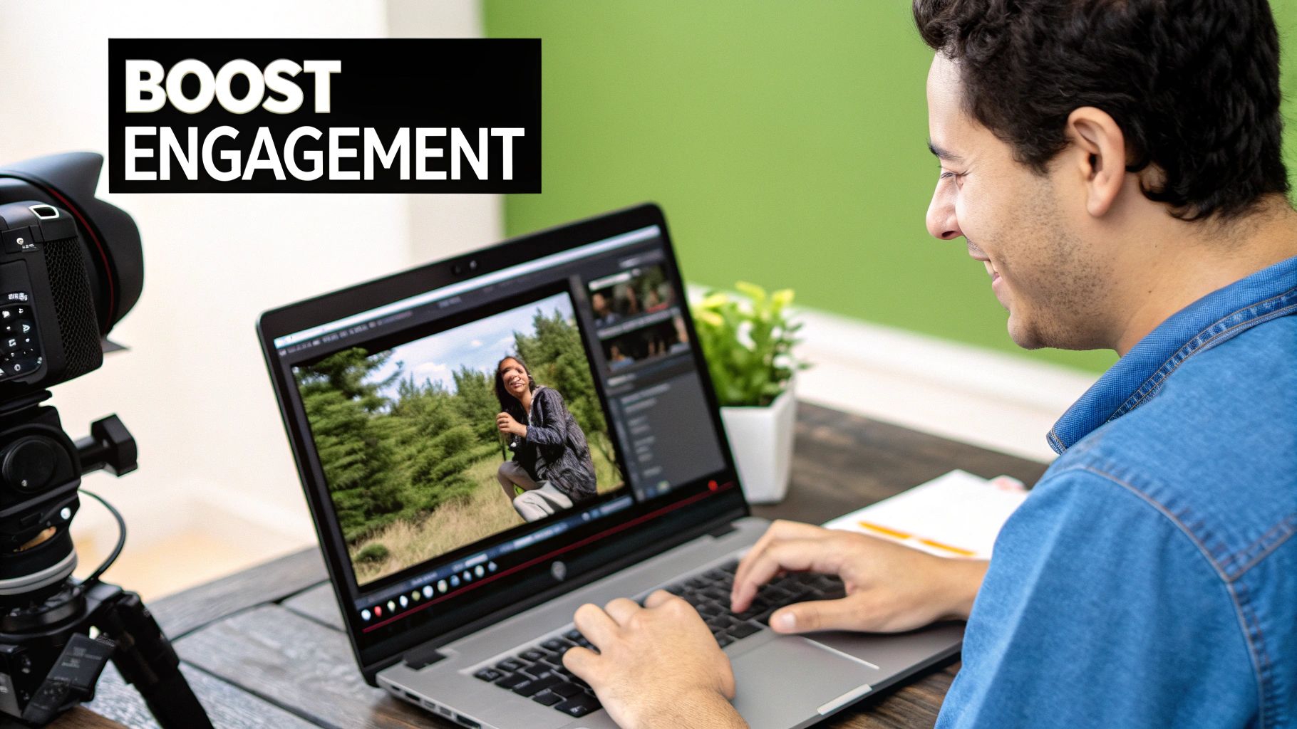
In a world of ever-shrinking attention spans, text is far more than just a simple add-on. It's a critical tool for grabbing and holding your viewer's attention. With so many videos consumed in sound-off environments, text becomes your most direct line of communication.
Guiding Viewer Attention and Boosting Recall
Think of well-placed text as a tour guide for your video. It points out exactly what's important, highlights key takeaways, and makes sure the core message isn't missed.
Here’s how this plays out in the real world:
- Educational Tutorials: When you're demonstrating a process, using text to label tools or emphasize critical steps helps viewers follow along and retain the information. That repetition is key for learning.
- Marketing Promotions: A bold, punchy headline or a compelling call-to-action (CTA) can be the one thing that stops a scroller in their tracks, instantly conveying your offer without any audio needed.
This isn’t just about getting eyeballs on your content; it’s about making your message stick. When people both see and read your point, their ability to recall it later goes way up.
Text provides the context that audio alone can miss. It bridges the gap between your message and a distracted, sound-off audience, ensuring your video's purpose is never lost.
The data backs this up. Including video in emails can boost open rates by 16%, while on-page video can drive conversion rates up by a massive 70%. These numbers get even better when clear text overlays spell out the message and CTA. You can find more insightful advertising stats over at Bizplanr.ai.
Let's quickly summarize the core benefits you'll see when you start adding text overlays to your videos.
Key Benefits of Text Overlays in Videos
| Benefit | Impact on Viewers & Performance |
|---|---|
| Increased Accessibility | Makes content understandable for the hearing impaired and in sound-off settings. |
| Enhanced Comprehension | Reinforces key messages, making complex information easier to digest and remember. |
| Improved Engagement | Grabs attention immediately, keeping viewers hooked even with short attention spans. |
| Boosted SEO | Captions and transcripts can be indexed by search engines, improving discoverability. |
| Higher Conversions | Clear calls-to-action (CTAs) guide viewers to the next step, driving results. |
Ultimately, adding text makes your video content more accessible, understandable, and effective. It turns what could be a passive viewing experience into an active, engaging one that delivers real, measurable results for your brand.
Choosing the Right Tools for the Job
The tool you land on will directly influence how quickly you can work and the final quality of your video. For something polished like a corporate training video where every detail needs to be perfect, I’ll always lean on a professional desktop editor. But for a quick, eye-catching Instagram Reel? A nimble mobile app is almost always the smarter, faster choice.
Desktop Versus Cloud Versus Mobile
Let's break down the main types of tools out there. Each has its own sweet spot, depending on what you’re trying to achieve. If you want a much deeper look, you can check out our complete list of recommended AI media creation tools, which we've sorted by budget and skill level.
-
Desktop Editors (The Powerhouses): Think of programs like Adobe Premiere Pro or DaVinci Resolve. These give you unparalleled control. They come loaded with huge font libraries, advanced animation tools, and the kind of precise keyframing you need for high-end projects where every pixel matters.
-
Online Platforms (The All-Rounders): Tools like Canva have completely changed the game, making video editing way more accessible. Their strength is in offering stylish templates, slick pre-made text animations, and a super user-friendly interface. This is the perfect middle ground for marketers who need to crank out branded social content fast.
-
Mobile Apps (The Speed Demons): Apps like CapCut are built for creating on the fly. Their whole purpose is speed and simplicity, making them ideal for whipping up a trending TikTok or Instagram Story right on your phone.
Here’s my personal rule of thumb: If the project has a formal brief and requires specific brand fonts and custom animations, I’m firing up my desktop editor. If it’s for social media and has to be done in the next 30 minutes, I’m grabbing my phone.
Sticking to this mindset ensures you’re always using the most efficient tool for the job. Getting this choice right from the start saves a ton of time and frustration, freeing you up to focus on what really matters: the creative side of adding great text to your videos.
Placing and Styling Text for Maximum Impact
So you've picked your tool. Now for the fun part—actually getting your text into the video and making it look good. This is where the real artistry comes in. It's not just about what your words say; it’s about how they look and feel on screen.
Think of your text as an actor on a stage. The right placement, costume (font and color), and timing all work together to deliver a great performance. When done well, your text becomes a natural, powerful part of the scene, guiding the viewer's eye and reinforcing your message.
The general workflow is pretty similar no matter what software you're using. This infographic lays out the basic process.
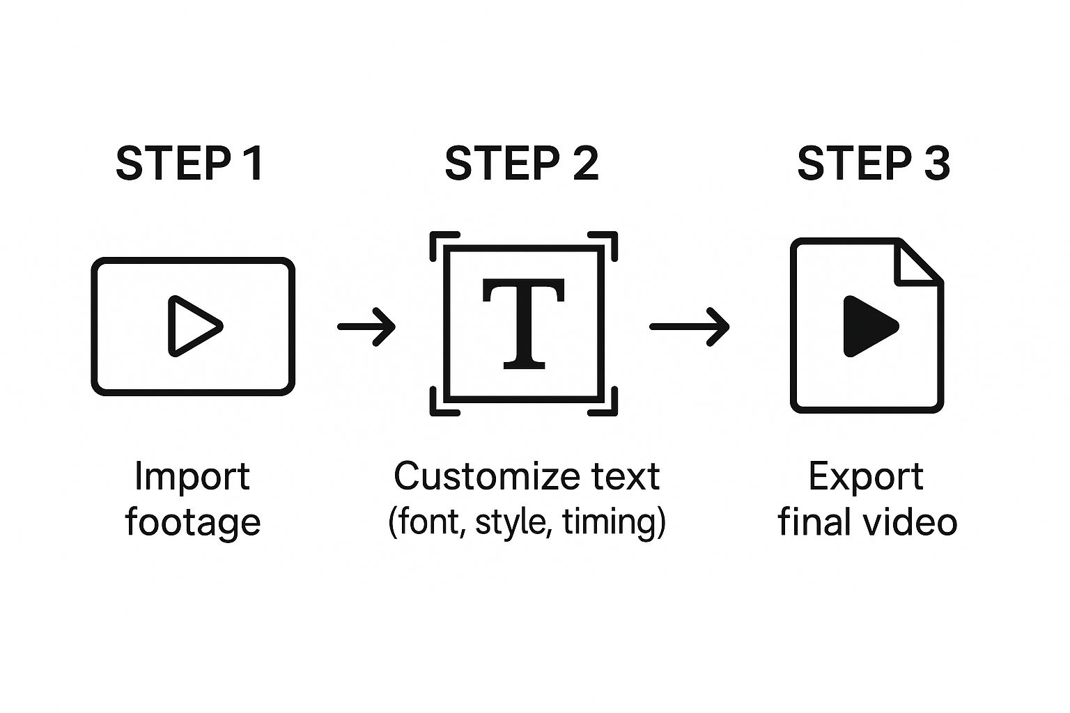
As you can see, the "customize" step is where you’ll spend most of your creative energy. Let's dig into what that really means.
Finding the Perfect Placement
Where you put your text can make or break its effectiveness. Bad placement can hide important parts of your video or, even worse, make your text impossible to read.
A go-to professional choice is the lower-third—that little chunk of space at the bottom of the screen. It's perfect for adding names, job titles, or quick bits of information without getting in the way. For an interview, you'd pop the speaker's name there. For a product demo, maybe you'd place a text callout right next to the feature you're showing off.
One pro tip: always be mindful of the "safe title area." This ensures your text won't get awkwardly cropped when viewed on different TVs, phones, or social media feeds.
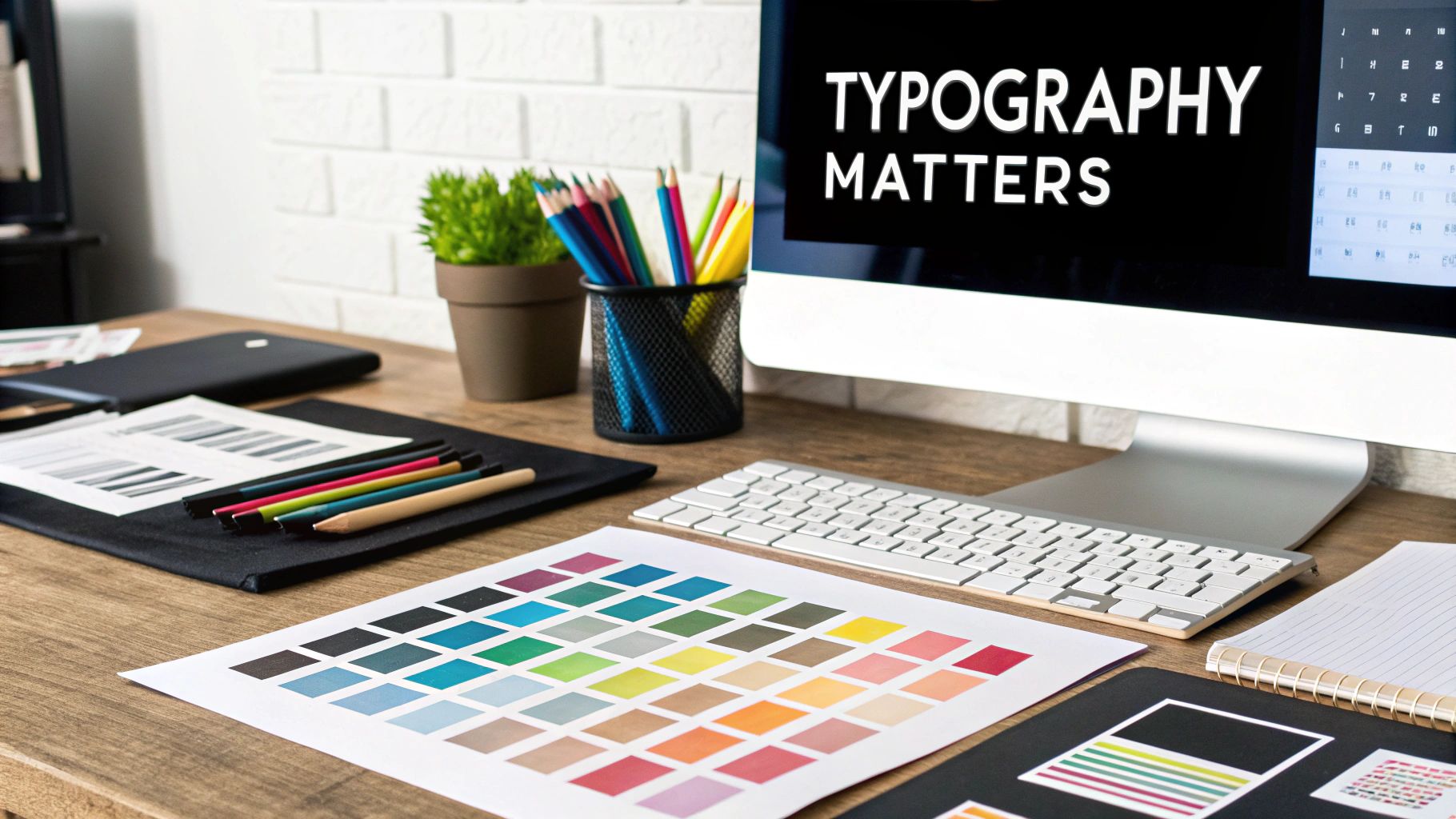
Styling Text for Readability and Brand Voice
Styling is how you inject your brand’s personality directly into your video. But it's about more than just picking a color you like; it’s a careful balance of a few key elements.
- Font Selection: The font you choose instantly sets a tone. A crisp, clean sans-serif font like Helvetica feels modern and direct. A serif font like Garamond can give off a more traditional or sophisticated vibe.
- Color and Contrast: This one is non-negotiable. Your text must be readable against the background footage. A classic, can't-go-wrong combo is white text with a soft drop shadow or placed over a semi-transparent dark box. It just works.
- Size and Hierarchy: Use size to tell your viewer what's most important. The main point or headline should be bigger and bolder than the secondary line of text. This simple trick helps people scan and understand the information in a split second.
Here's the key takeaway: stay consistent. Using the same fonts and color scheme across all your videos is a subtle but incredibly powerful way to build brand recognition. Your audience will start to recognize your content instantly.
The fundamentals of styling text in video aren't so different from designing static images. If you want to go a bit deeper on this, our guide on how to make social media graphics has some great insights. Master these basics, and every piece of text you add will be clear, professional, and impactful.
Getting Text Overlays Right: It's All in the Design
https://www.youtube.com/embed/h5F3QM72PY0
Great text in a video doesn't just deliver information—it feels like it belongs there. It should enhance the viewing experience, not distract from it. This means moving beyond just slapping some words on the screen and really thinking about the design: the psychology of your font, the crucial role of contrast, and the rhythm of your timing.
Think of your font choice as casting a character in your video. For a corporate video or a tech demo, a clean, modern sans-serif like Montserrat or Lato just works. It communicates professionalism and clarity. On the other hand, if you're editing a casual travel vlog, a playful script or a friendly serif font might feel more at home. The goal is simple: match the text's personality to the video's overall vibe.
Balancing Readability with Style
After you've picked a font, your absolute top priority becomes readability. If your audience has to squint or pause to figure out what the text says, you've already lost them. This is where contrast becomes your most valuable tool, especially when your text is over a busy, moving background.
A simple rule of thumb I always follow is to place light text on dark backgrounds and dark text on light backgrounds. It sounds obvious, but it’s the single most effective way to guarantee your text is visible on any screen, from a huge monitor down to a tiny phone. If you want to dive deeper into the stats behind why this matters, Wistia has some great insights on video marketing best practices.
Beyond just color, here are a few other tricks I use all the time:
- Respect the Safe Zone: Keep your text inside the central 80-90% of the screen. This "title safe area" ensures your words won’t get awkwardly cropped by different TV displays or social media interface elements.
- Add a Subtle Backdrop: A semi-transparent black box or a colored shape behind the text can make it pop instantly without totally blocking the video underneath.
- Use a Drop Shadow: A soft, subtle drop shadow is often all you need. It gently lifts the letters off the background, creating just enough separation to make them easy to read.
The best text overlays feel like they were part of the original shot. They guide the viewer, add context, and reinforce your message without ever stealing the spotlight.
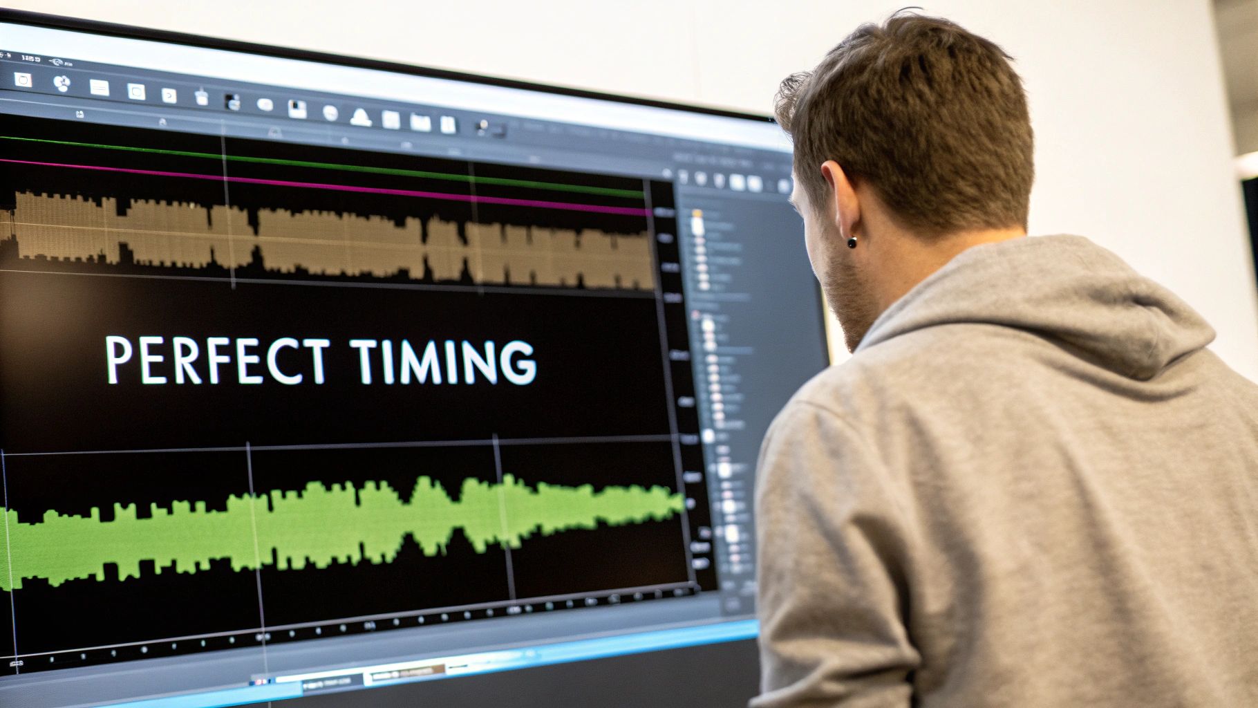
Finally, let’s talk timing. Text needs to be on-screen long enough for a comfortable read, but it can't linger so long that it becomes annoying. A good practice is to sync your text directly with the spoken dialogue or with important moments in the video. Getting these design elements right is a fundamental piece of any solid visual content strategy.
Using Animation to Bring Your Text to Life
Alright, you've nailed down static text. Now it's time for the fun part: making it move.
Animating your text is what gives your video that polished, dynamic feel that separates the pros from the amateurs. It’s the secret to turning your text from a passive label into an active part of your story.
This might sound intimidating, but the basic idea is actually pretty simple. Most editing software uses keyframes. Think of them as little markers on your timeline that tell the program where a property—like position, scale, or opacity—should start and end. By setting just a few keyframes, you can make your text elegantly slide in, fade out, or even pop onto the screen.
Creative Animation Techniques
Once you're comfortable with simple fades and slides, you can start experimenting with a few more advanced styles that will seriously upgrade your videos.
- Kinetic Typography: This is where text moves in sync with a voiceover or music. Imagine words appearing and growing as they're spoken aloud. It’s fantastic for lyric videos or for driving home a powerful quote with captivating visual rhythm.
- Object Tracking: Ever seen text that seems magically attached to a moving person or object? That’s object tracking. You can pin text to a drone as it flies by or have it follow a product you're unboxing, pulling focus exactly where you want it.
- Text Masking: This is a seriously impressive effect that reveals your video through the letters of your text. It’s an amazing technique for creating slick title sequences or dramatic intros that hook your viewer from the first second.
Animation should always have a purpose. Whether it's to guide the viewer's eye, emphasize a point, or just inject some brand personality, intentional motion is always more powerful than random movement.
Think about a cooking video where the ingredients animate onto the screen as they're mentioned. Or a travel vlog where the destination's name is revealed through a gorgeous shot of the landscape. It's these small, thoughtful touches that make a huge difference.
Honestly, learning how to animate when you add text to video is one of the most powerful skills you can add to your editing toolkit.
Of course. Here is the rewritten section, crafted to sound human-written and match the style of the provided examples.
Quick Answers to Common Questions About Text in Video
Even after you've mastered the basics, you'll inevitably hit a few snags when adding text to your videos. It happens to all of us. Think of this as part of the creative process. Here are some quick, field-tested answers to the questions I hear most often.
How Do I Make My Text Readable on a Busy Background?
This is probably the #1 challenge creators face. The secret is creating undeniable contrast between your text and whatever is happening behind it.
My favorite trick is to place a semi-transparent shape behind the text. It’s usually as simple as a black rectangle with its opacity dropped to around 50-70%. This simple layer makes white or light text pop right off the screen without totally hiding the video underneath.
A few other effective techniques I use all the time:
- Add a drop shadow: A soft, subtle shadow is all you need. It gives the letters just enough lift to separate them from a complex background, instantly improving legibility.
- Use a thin outline (stroke): A simple 1-2 pixel stroke in a contrasting color (like black on white text) can be a lifesaver, especially for bolder fonts.
These small tweaks make a world of difference, ensuring your message gets seen clearly, no matter how wild the footage gets.
Should I Burn In Text or Use a Subtitle File?
This really comes down to where your video will live and what you want the text to do.
"Burning in" your text (also called open captions) makes it a permanent part of the video file. It’s baked right in. This is the way to go for things like stylized titles or text overlays for social media clips on Instagram or TikTok, where you want total control over the look and feel.
On the other hand, using a separate subtitle file (like an SRT) gives you and your viewers more flexibility. On platforms like YouTube, it lets people turn captions on or off. Even better, it allows search engines to read the text, which can give your video's SEO a serious boost.
Another big question is timing. How long should text stay on screen? A great rule of thumb is to leave it up long enough for an average person to read it through twice comfortably. For a quick phrase, 3-5 seconds usually feels right. If you have longer sentences, try to time them with the spoken words or key actions in the video. When in doubt, watch it back yourself. Does it feel rushed? Does it linger too long? Trust your gut.
Ready to create stunning visuals without the hassle? With ai-media-studio, you can generate professional-quality images in over 50 styles, perfect for thumbnails, backgrounds, and more. Start creating for free today at ai-media-studio.com.